elusive bus ETAs
04/09/2024
my dive into realtime transit data systems
This strange little project started one April afternoon in 2022 when I was waiting for the bus to take me home from school. For some context, my school is unfortunately located in a way that it takes a transfer across at least two buses to get home, meaning there are multiple possible routes. Because of this, I’m always looking for the fastest route.
So on this spring afternoon, I opened up Google Maps, clicked the first option, and walked to the corresponding bus stop. I expected the bus to arrive in a few minutes, because that’s what Google Maps said. But 20 minutes later, it still had not arrived. I opened Google Maps again. The same bus was now supposedly 10 minutes away. Frustrated, I ran to a different bus stop to try another route. Just as I arrived, the bus I was waiting for earlier passed by (even though it was still 6 minutes away on Google Maps). If only I had waited a few more minutes, I would have caught it. I ended up waiting another 15 minutes for the second bus.
This infuriating experience, along with multiple others, led me to wonder: why are bus ETAs sometimes so inaccurate? I decided to look into how they were generated.
Note: ETA stands for Estimated Time of Arrival, which is the predicted time a vehicle will arrive at a stop. I may also use the term “arrival time prediction” to refer to the same thing.
transit apps and gtfs
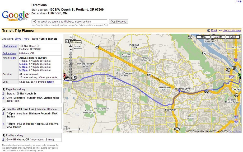
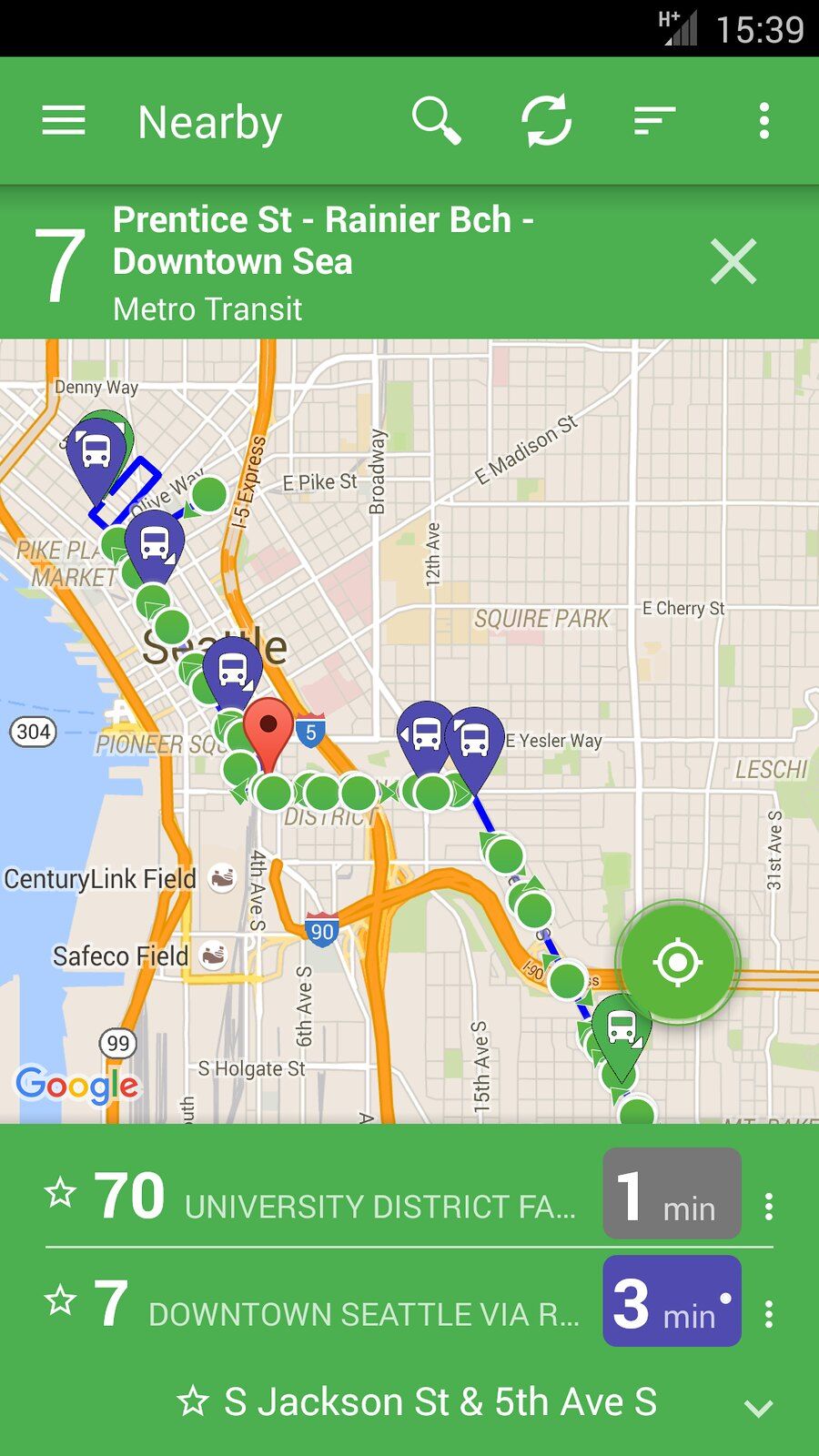
Initially, I used Google Maps to get bus ETAs and plan my routes, but I later tried other apps including Onebusaway, Transit, and Moovit. Turns out, they all get their data from the same source: a GTFS (General Transit Feed Specification) feed. The G in GTFS initially stood for Google, who developed it in 2005 for use in the Google Transit Trip Planner.

Nowadays, GTFS is a standardized format used by countless transit agencies around the world. It includes both static and realtime data.
GTFS static data is a collection of CSV files that describe a transit system. It’s sort of like a big address book. Applications that deal with transit data use the GTFS static dataset as a reference to get the correct locations, names, and schedules of buses and stops. The GTFS static dataset for my local agency includes a file for agencies, calendars, calendar dates, fares, routes, shapes (geographic paths of routes), trips (a specific bus on route at a specific time), stops, and stop times (when trips arrive at stops). GTFS static datasets are usually updated every few months to reflect schedule changes, but are otherwise unchanged.
GTFS realtime data is different. It’s a stream of data, usually an API, that updates every few seconds to reflect the current state of the transit system. This includes the trip updates, vehicle positions, and service alerts. Looking at the format specifically, its surprisingly lacking in complexity. The vehicle positions feed is very straightforward: it’s just a list of every single active vehicle, with latitude, longitude, and related ids for each. The trip updates feed includes a list of every active trip, with each trip containing a list of stops, and each stop containing the predicted arrival time. Here is an example trip update:
{
    "trip": {
        "trip_id": "635436746",
        "direction_id": 1,
        "route_id": "100004",
        "start_date": "20240409",
        "schedule_relationship": "SCHEDULED"
    },
    "stop_time_update": [
        {
            "stop_sequence": 143,
            "stop_id": "54990",
            "arrival": {
                "delay": -25,
                "time": 1712724355
            },
            "departure": {
                "delay": -25,
                "time": 1712724355
            },
            "schedule_relationship": "SCHEDULED"
        },
        ...more stop time updates
    ],
    "vehicle": {
        "id": "7430",
        "label": "7430"
    },
    "timestamp": 1712724443
}
The GTFS realtime spec also contains optional fields for other information like vehicle bearing, occupancy status, etc. but unfortunately King County Metro does not provide them. The other service alert feed is not really relevant to arrival time predictions, so I won’t go into it. But it’s pretty easy to see how an app like Google Maps would use this data to display ETAs and bus locations.
Its worth discussing Onebusaway at this point. Onebusaway was created by University of Washington students Brian Ferris and Kari Watkins in 2008. It gained popularity in the Seattle area because it was the first app to provide realtime bus data to the public. Google hired Brian Ferris in 2011 and subsequently implemented real-time transit data in Google Maps later that year. Because of this, and the numerous other apps that have appeared since, Onebusaway is not as prominent. However, as an open source project, it has been used by many transit agencies for their official apps, including New York’s MTA.
Even though the interface is a bit dated, I still prefer Onebusaway because of the straightforward map view that allows me to see information for any nearby bus stop. Google maps and Transit are more suited for planning out entire trips in advance. Onebusaway is also more reliable in my experience, but the data should be the same across all apps.

predicting arrival times
I’ve explained the GTFS format and how it’s used in transit apps. But where does the GTFS realtime data come from? And how are the arrival time predictions made?
GTFS realtime data is usually provided by the transit agency itself. In the case of King County Metro, they have a developer resources page that includes links to their GTFS static and realtime data. But they don’t provide much information on how the data is generated.
While researching Onebusaway, I came across another open-source project called Transitime. Transitime is a piece of software that uses real-time GPS data to generate public transportation information, usually in the form of GTFS realtime data. It seems to be actively managed by the company Swiftly, but there is also a somewhat maintained open-source version on Github. I can’t be sure if King County Metro uses Transitime either, but it should serve as a good example of how arrival time predictions are made.
Looking through Transitime’s Java code, a name caught my eye: Kalman. The Kalman filter is a mathematical technique that uses a series of measurements observed over time to produce estimates of unknown variables. I won’t pretend to understand the math behind it, but I can see how it is applied. When given the GPS location of a bus, Transitime can use the bus’s historical data along its route to predict its most probable future position from the current position. This is how it can predict when a bus will arrive at a stop. It isn’t as simple as interpolating a moving object along a path though. Buses stop (or “dwell”) for varying amounts of time at stops, and this often won’t be reflected by periodic GPS data. There are also other factors like layovers, route modifications, and schedule changes that can affect arrival times. Transitime attempts to take all of this into account to make accurate predictions.
It was at this point that I realized how difficult it is to make accurate arrival time predictions. Even outside of the transit system itself, there are so many factors that can affect a bus’s arrival time. Traffic, weather, accidents, and construction are just a few examples. It’s impossible to perfectly predict the future. This is why bus ETAs are sometimes so inaccurate.
measuring prediction accuracy
I wanted to see exactly how accurate the arrival time predictions were for King County Metro, so I wrote a few Python scripts that consumed the GTFS realtime data. This eventually ended up becoming the basis for my IB Math IA paper.
The first issue I ran into is that the actual arrival times are not provided in the GTFS realtime data. This is because GPS updates from buses come periodically. I’m not too sure what determines the frequency of these updates, but I think it’s around every 30 seconds for King County Metro. With these sporadic updates, it is impossible to determine the exact time a bus arrives at a stop. However, buses would sometimes send a location update when they were at a stop. Thus, I decided to use physical location to determine when a bus arrived at a stop. I compared the latitude and longitude of the bus to the latitude and longitude of the stop. If the bus was within 30m of the stop, I considered the time of the location update to be the arrival time. This method is far from perfect, but it was the best I could do at the time (I later realized that Transitime has to deal with this exact issue, and they use a much better method of interpolating the bus’s position to determine the most likely arrival time).
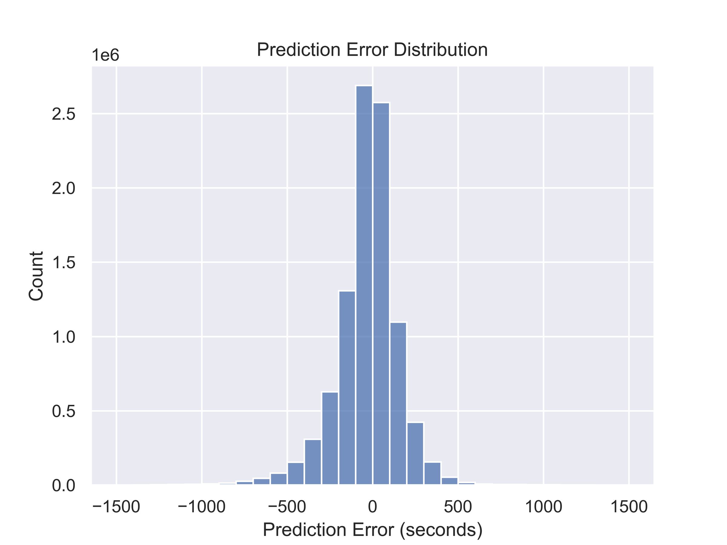
I then compared the predicted arrival times to the actual arrival times. My script would periodically fetch the GTFS realtime data, and compare the predicted arrival times to the actual arrival times for every single stop and bus. I ran this script for 24 hours because I was rushed writing my math paper. The script generated a ton of data, 9626073 data points and 700MB in 24 hours. Below is a histogram of the prediction error. I calculated prediction error as the difference between the predicted arrival time and the actual arrival time. Positive values indicate that a bus arrived later than predicted, and negative values indicate that a bus arrived earlier than predicted.

You can see that the majority of the predictions are within 500 seconds of the actual arrival time, or about 8 minutes. There are some outliers significantly higher than this, likely due to the prediction algorithm not being able to account for factors like schedule changes or cancelled buses. There is a slight positive skew, which indicates that predictions tend to be earlier than late. This good for bus riders because it is better to arrive at a bus stop early than miss a bus entirely.
I also calculated the mean absolute error, which is the average of the absolute value of prediction error (averaging positive and negative prediction errors would cancel them out). The mean absolute error was 129.15 seconds, or about 2 minutes. This means that on average, the predictions were off by 2 minutes. This is not too bad, but it’s also not great. Given the inaccurate methods I used to determine actual arrival times, I think this is a reasonable result.
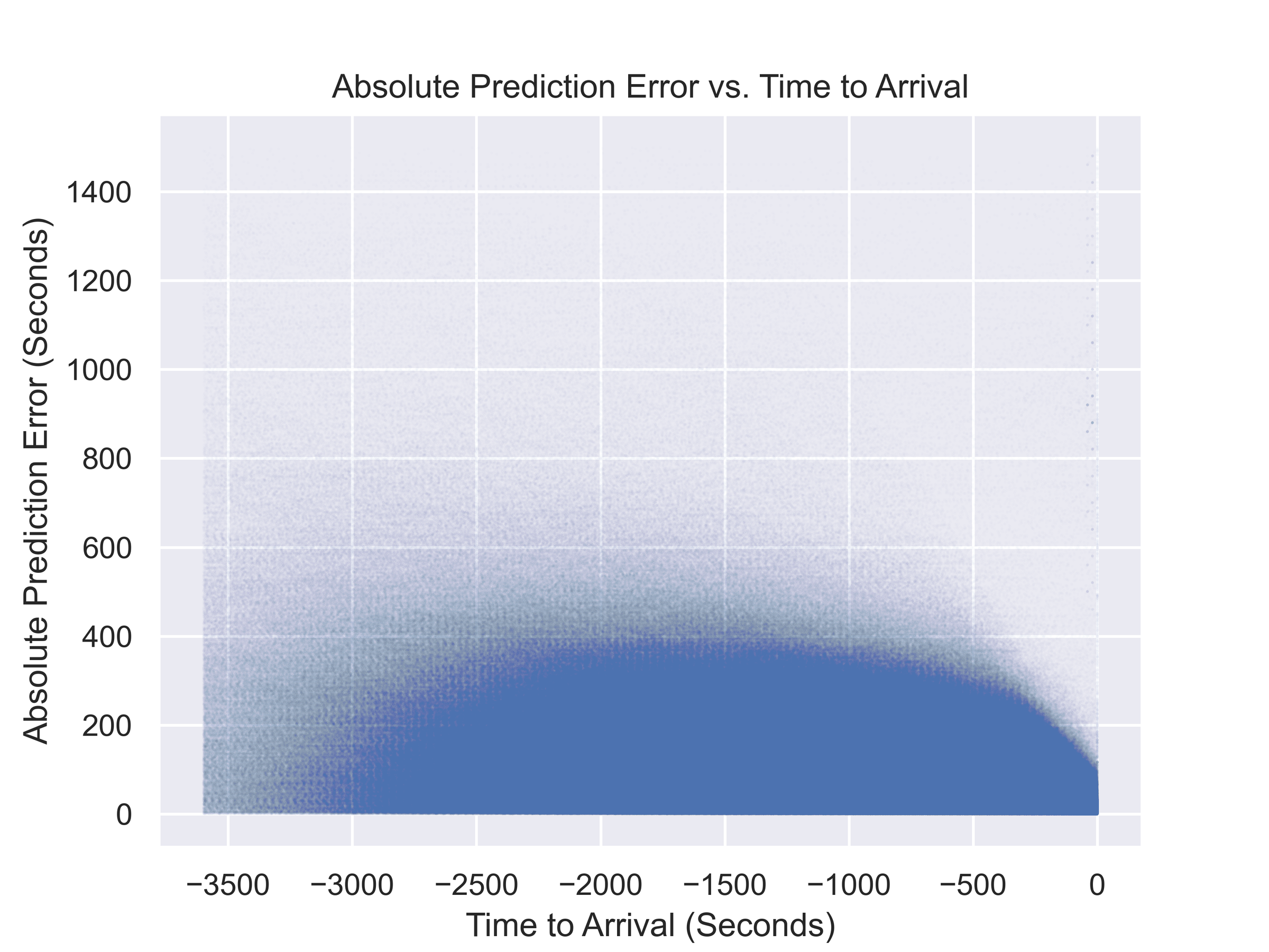
I graphed the mean absolute error on a scatter plot, with the x-axis being the relative time the prediction was made. I wanted to see if the predictions got more accurate as the bus got closer to the stop, which would make sense.

It’s a pretty fuzzy graph due to the sheer number of data points (I set the alpha of each point to the minimum of 0.01, but it still doesn’t really differentiate density). The graph does show a slight trend of predictions getting more accurate as the bus gets closer to the stop on the right side of the graph. It also shows the extent of inaccuracy in the predictions. Some of this is definitely due to issues with my methodology, but it’s safe to assume that predictions made an hour before the bus arrives are not very reliable.
Obviously, there are some pretty significant issues with this data. For one, it is only from one day. Additionally, my method of determining actual arrival times is not very accurate, as outlined earlier. The script does not account for schedule changes, cancelled buses, or other factors that could affect arrival times. However, I think the data is still useful for showing the general accuracy of the predictions. It also demonstrates that at least some bus predictions are very inaccurate, which explains some of my past experiences. If I had more time, I would have liked to run the script for a longer period of time, and maybe even compare the prediction accuracies of different transit agencies.
The code and data used for this project and my math paper can be found on my Github.
conclusion
The reliability of the existing predictions is already quite impressive. Given the complexity of predicting bus arrival times, improving predictions is not an easy task.
However, I do think there are some ways to improve. The fundamental reason Transitime and Onebusaway have to use so much interpolation is that buses only provide sporadic GPS updates. If individual buses had more frequent location updates, it would be easier to determine their exact position, and thus make more accurate predictions. Additionally, if buses could provide exact stop arrival times (like with a sensor that detects when the doors open), predictions could be improved even further. This would certainly require costly hardware upgrades, but I believe it is possible.
Another potential way to improve predictions is to use machine learning. Machine learning models could be trained on historical data to predict arrival times. Given machine learning’s success in other fields, I think it could be a viable option for transit agencies. However, it would likely require a lot more computational power than the current methods.
A major challenge in this field is the lack of funding and financial incentive. Projects like Onebusaway and Transitime have aging Java codebases that are slowly developed by a few dedicated people over time. Recently, the Open Software Transit Foundation, which runs Onebusaway, posted a blog post asking for financial support. On the other hand, transit agencies are already struggling to provide reliable service, and investing in slightly better arrival time predictions is certainly not a priority. However, improving arrival time predictions could lead to more people using public transit, which would benefit the agencies in the long run. It’s a bit of a catch-22.
As for me, this exploration into bus ETAs has been an enlightening experience. I’ve learned a lot about how transit apps work, and the challenges that come with predicting bus arrival times. It’s shifted my perspective on the complexity of public transit systems. I also gained some experience with Python and data analysis, which I think will be useful in the future.